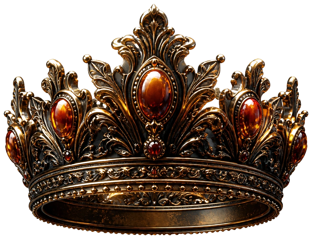
Recognition beats decoration
You need a flag: colors, type, and one visual motif. Not a brand book. Open Canva and make a kit: avatar, banner, Open Graph image, and a simple one-pager. Use two fonts max and one accent color. Constraints create taste.
If you want custom art, generate a motif in Midjourney — a crown, a map, a stamp — then strip it down. Avoid the default "AI glow" look unless irony is the brand. Distinctive beats trendy.
Keep the UI honest
If you are shipping software or a serious site, rough the key screens in Figma. One homepage, one checkout or signup, one "aha" screen. Labels should match the offer from Part 2. If Figma feels heavy, stick to Canva mockups and move on. Tools exist to finish work, not to host identity crises.
Export assets into a single folder named brand-v1. Version numbers prevent "final_final_really" chaos.
Ship ugly with pride
A clear offer in a plain layout beats a gorgeous homepage that hides the price. You can restyle after the first ten customers complain about something real.
Running tip: once a quarter, refresh the OG image and social avatar. Stale visuals signal a stale product even when you are shipping.
Field notes
Field note: your flag should survive a tiny favicon. If the mark only works as a hero illustration, it is decoration, not identity. Test it at 32 pixels. Humility is a design tool.
Reuse the same accent color in emails, invoices, and social so strangers start to recognize you before they remember your name. Recognition compounds slower than ads, and lasts longer.
Operator checklist
Operator checklist: lock two colors, two typefaces, and one motif by end of week. Export avatar, banner, and a 1200×630 Open Graph image. Store them in brand-v1. Do not iterate in public until customers exist.
Build three social templates in Canva: teaching, proof, and announcement. Reuse them until they feel boring. Boring systems ship.
Show the kit to five people in the niche. Ask which version feels most trustworthy on a phone. Ship that version even if you like the other one more.
How to run it this week
Define accessibility basics: contrast, readable type, alt text on key images. Looking premium includes being usable. Broken contrast is not an aesthetic.
Create templates for quote graphics and changelog posts so you are not redesigning under deadline. Templates are future calm.
Ask five people which mock feels more trustworthy. Trust beats cool. Cool without trust is a costume.
What good looks like
What good looks like: a brand-v1 folder with avatar, banner, OG image, and two fonts you will not abandon next week. Recognition starts with restraint.
Common failure mode: redesigning instead of publishing. Taste improves in public, not in Figma exile.
Series bridge
Series bridge: this chapter sits between studying who already rules and launching the outpost. If you skipped here, go back one part and finish the checklist first. The playbook only compounds when each layer is real — research under offer, offer under site, site under product, product under distribution.
Keep a single Notion page titled Kingdom OS and paste the outcome of this part at the bottom before you leave. Date it. Future you will skim twenty dated notes faster than twenty open browser tabs. That page becomes the operating system the last chapter asks you to run daily.